
TLDR
Led a multi-month, multi-discipline team through 6 rounds of usability testing and iterating, addressing the four largest customer issues (what are my coverages, how do I edit coverages, what’s my quote impact when I edit coverages, how do I now purchase), reducing or eliminating these specific complaints and increasing online purchases. This led to a 650% increase in clicks into the purchase flow (from 2% to 15%) with people who’ve edited their coverages to their needs and a 50% increase for people who didn’t edit their coverages (from 10% to 15%). We also moved the Discount page into the main flow, to increase customer trust and assurance that they were getting the best possible rates. Previously this had been a link on the Quote Summary screen most people missed.
The challenge
Allstate’s online quoting tool was redesigned and the new experience launched April 2018. Because of the enormous complexities of the industry, database interactions with the site, and customer data needs and experience demands, we went live with an MVP version with room for improvements. The site’s two main metrics are its ability to 1) provide sales leads to insurance agents (capturing phone numbers and emails) and 2) percentage of completed quotes. We soon discovered via Foresee comments, chat interactions and metrics, that there were multiple issues with the quote and edit coverages pages that were the main complaints of the site, and were tasked with fixing them.
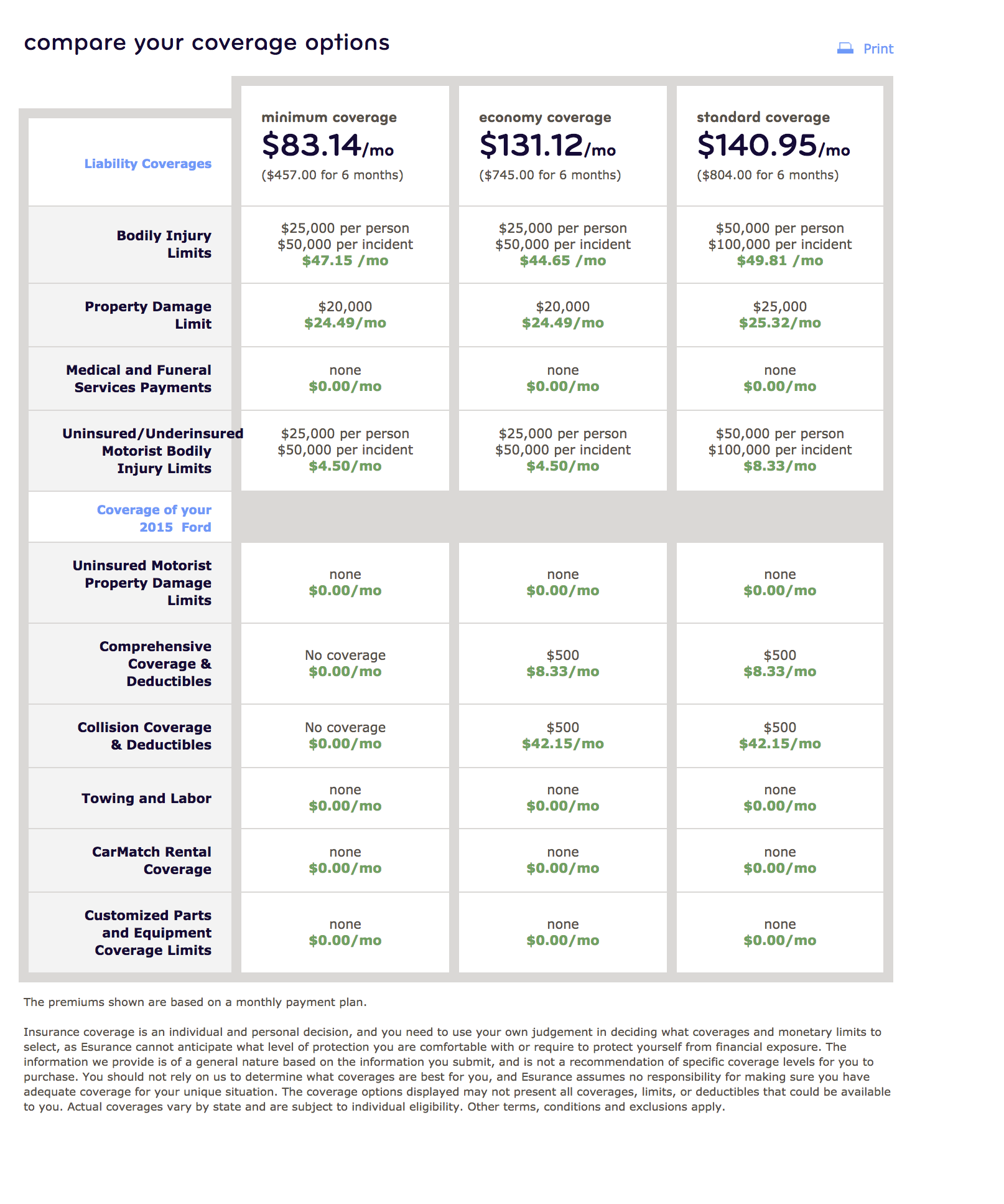
To get a quote, you enter in all your details, and land on a Coverages Before Quote screen where you choose between Basic, Balanced or Full coverage for your auto or home. You are on a page that talks about coverages without showing you any actual coverages, or data points, to base your decisions.

Coverages before quote
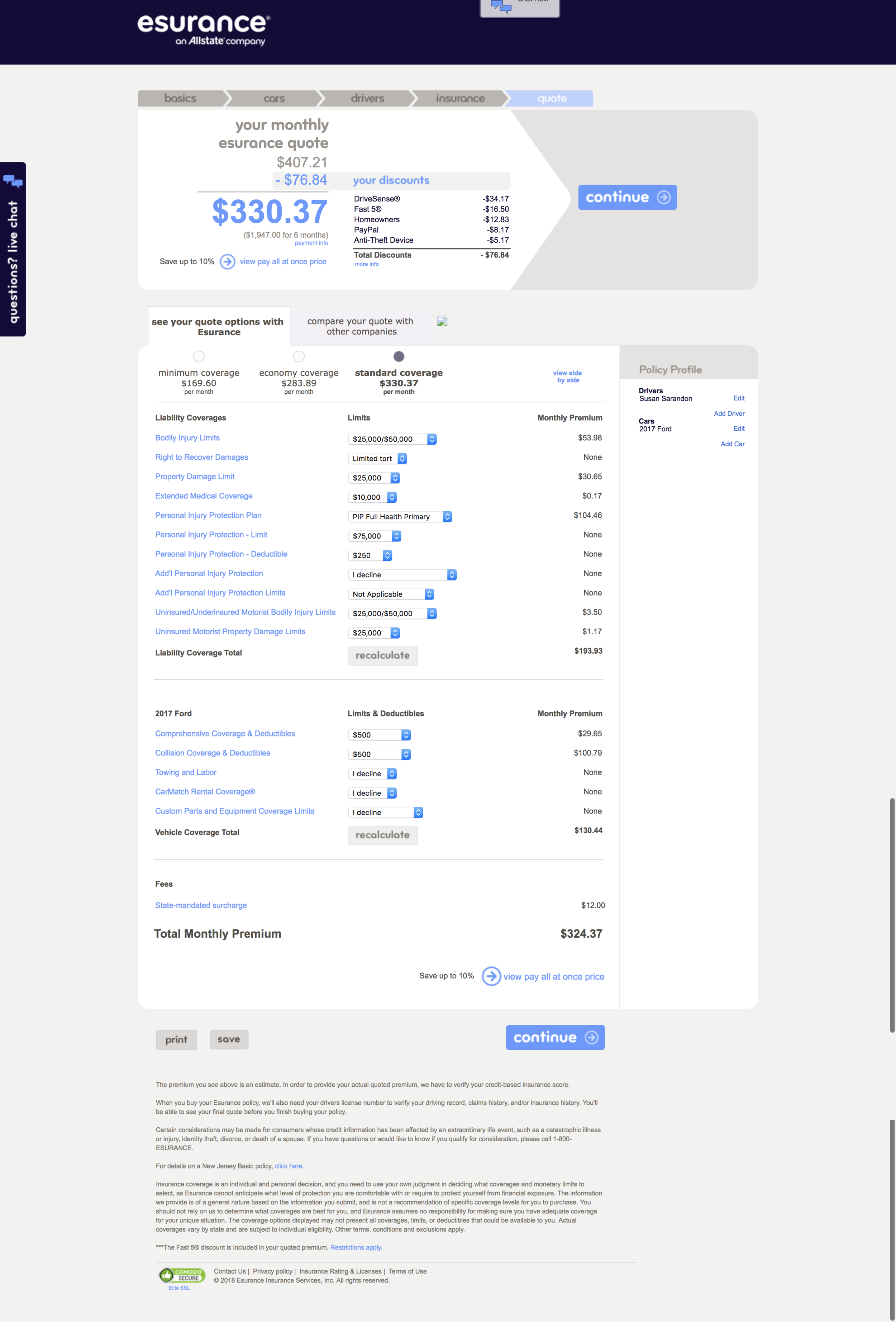
You then go to a Quote Summary screen which high level shows you the products in your quote and their costs. You need to find the button labeled ‘View & Edit Details’ to view your actual coverages and amounts. In testing people miss it and only click it when prompted.

Quote summary
On the Quote Details screen you can simply view coverages and costs. You need to click the ‘Edit Coverages’ button to be able to make changes. Or ‘Back to Quote Summary’ button to move up a level to move forward and ‘Buy Now’. Imagine how far down on mobile you’d need to scroll to figure out how to edit.

Quote details
The Edit Coverages screen:
1) Is overwhelmingly long with the CTA lost at the bottom
2) There is no way to move forward in the experience. You need to move back up two levels to Quote Summary to move forward to purchase.
3) There is not a total monthly cost displayed on the screen for the either individual product or bundled quote. You need to click ‘Recalculate’ to update the data and go up a level to the Quote Details to see the impact changes made to your quote. And go up another level to Quote Summary to move forward to purchase.

Edit coverages
Our baseline metrics were :
2% of click ‘Buy Now’ after editing their coverages
GOALS

Constraints
Research - While we had more research resources than usual, we needed to be efficient and focused.
Technical: Database calls - Certain calls need to be done at certain points limiting what could be done where.
The Solution
Re-design the experience in four specific ways:
1) Remove the multiple layers of Quote pages
2) Give customers actual coverage values when talking about coverages in the experience (versus non-detailed level Basic, Full, Enhanced descriptors)
3) Allow for easily discoverable editing
4) Show a consistently visible path forward
My Design Role and Tools
As the UXA lead on this project, I coordinated across UX disciplines (Architects, Content, Visual Designers, Front End Engineers, Back End Engineers, Research) and Business (Product Owners, Business Analysts) to get a next-level experience to launch.
My decisions resulted in many of the design updates, including: the primary and secondary tab designs, the sticky/floating cost summary with CTA on mobile/desktop, auto-recalculation of quote once coverages were updated, the elimination of a screen that provided, per users, zero value (Coverages Before Quote), and the compression of 3 quote screens into one.
Design Role
Competitive Landscape Research
Metrics Review
Lofi and Hifi Wireframes
Prototyping
Oversaw 6 Research Rounds
Design Tools
Sketch
InvisionApp
Competitive Research
I looked at competitors, including Hippo, Lemonade, Travelers, State Farm, Progressive, Geico, Liberty Mutual and eSurance, and aggregator sites such as Compare.com, Zebra and NerdWallet to understand how they display complex information and allow for comparisons and editing.
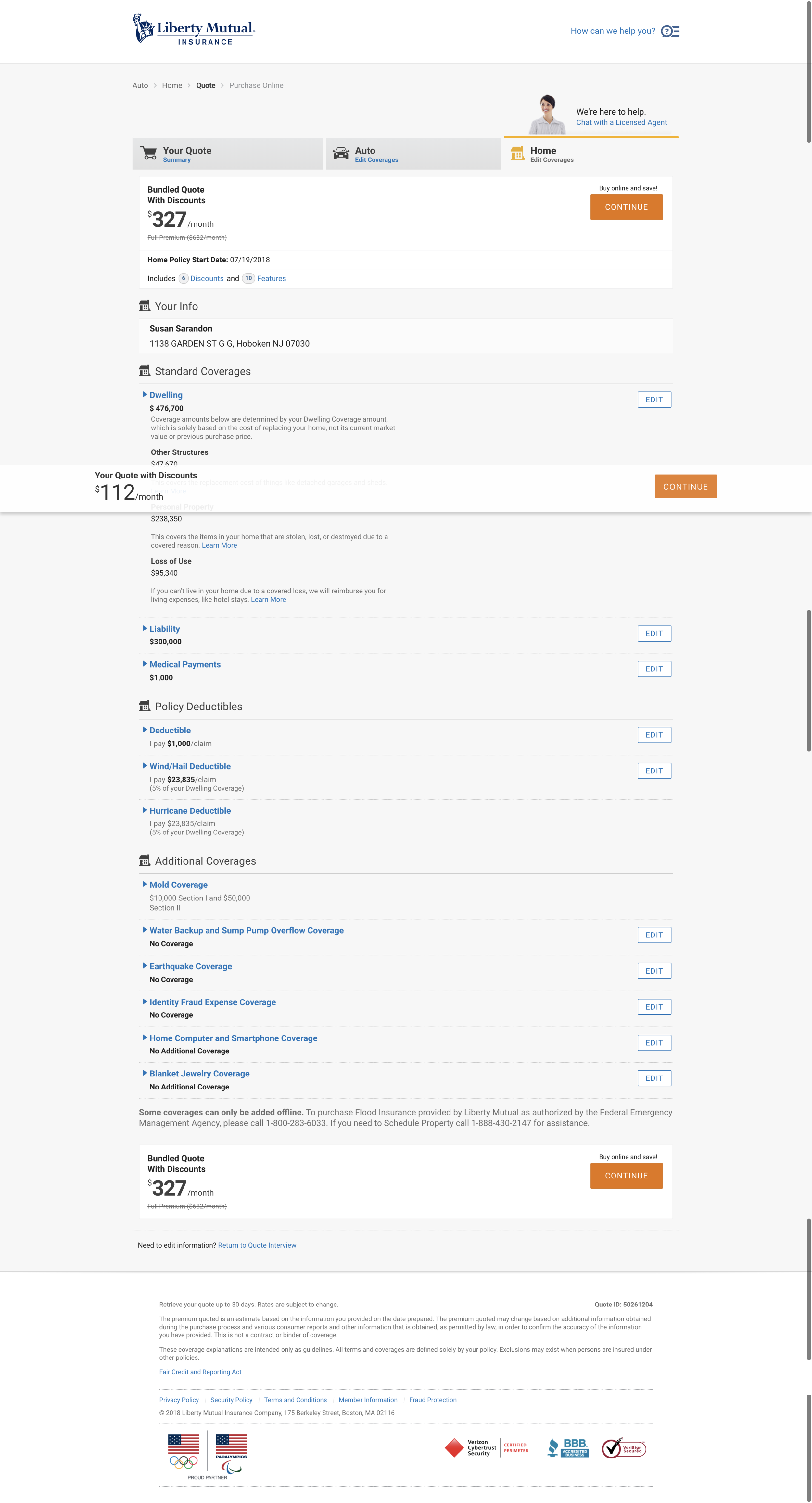
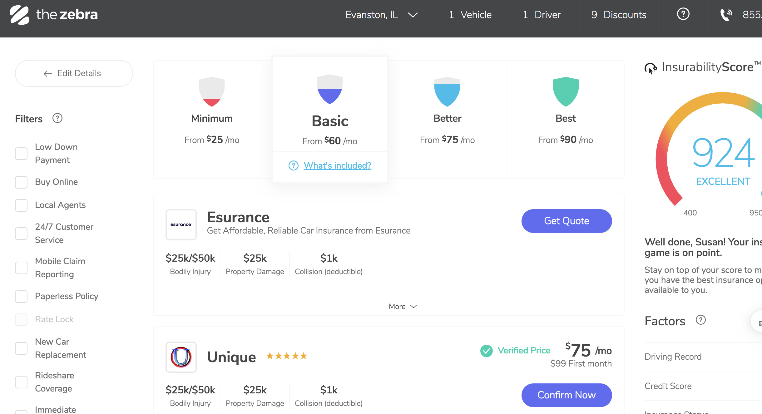
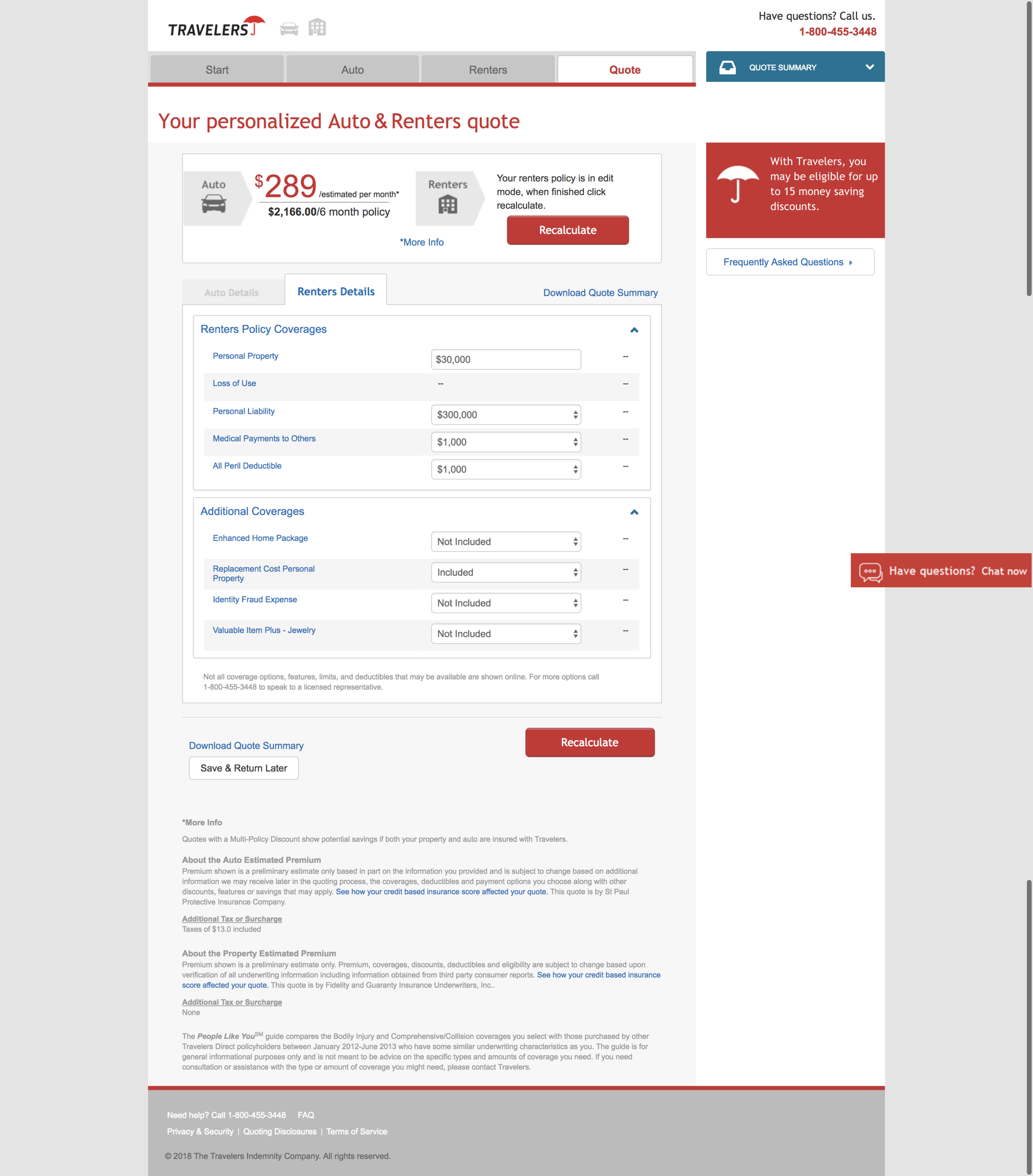
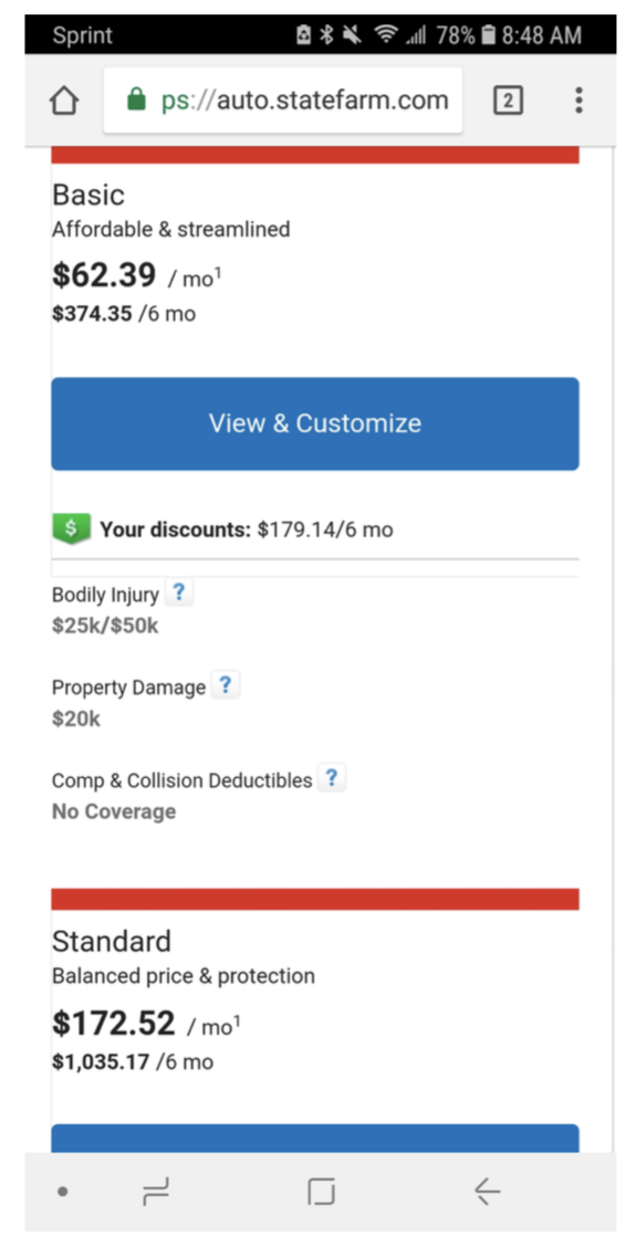
Click images to move through the carousal above.
Metrics Review
Determining what to solve for we turned to metrics-based user flows.


Our assumptions:
1) There was a high frequency of navigation from Coverages Before Quote (with the generically labeled “Basic, Balanced, Full” coverage options, to Quote Summary, then back to Coverages Before Quote to select each additional option to see what the quotes looked like one at a time. There wasn’t (10%).
2) There was a low number of people who could move forward after going down the Quote page layers. The numbers were in fact low. (14% of people who navigated to the Quote Details screen went back to the Quote Summary screen, the only page with the ability to move to on to purchase.)
Prototyping
Round 5 desktop prototype (PDF)

Usability Research
We first designed for and tested for responsive screen sizes, ensuring all features would work for all users. Unlike our legacy design where if something couldn’t perform on mobile it was excluded (ex. comparison chart).
Key learnings from final round of research:
Without issue, the primary product tabs and secondary tabs with coverage options were understood and easy to navigate
Having one Quote screen versus three (Quote Summary, Quote Details, Edit Coverages) fit user experience expectations and allowed for ease of editing and purchase.
Grouping coverages into three categories - Covers Others When You’re at Fault, Covers You and Others, Covers Your Vehicles - helped comprehension
Accordions
People requested high level info to be displayed to help them understand if they need to open and edit
People used the illustrations to understand coverages
Cost summary
Floats down the screen on desktop, is fixed to the bottom of the screen on mobile, providing an always visible price and way forward via the green button.
FINAL DESIGNS

New Quote screen (preliminary design)

Comparison table (preliminary design)

Mobile comparison table
Reflections
Looking back at this project there are some things I would have done differently.
I would have micro-diagrammed concepts by hand, instead of working directly in Sketch. I was easily lost in the weeds of details from the beginning trying to solve for everything at the same time.
I would have full team meetings with POs, BAs and back end developers earlier. We had a weekly cadence beginning mid-project that allowed for good technical discussions. This project could have benefitted from an increased frequency of them sooner.
We would have had a proof of concept (POC) testing a design variation we had combining multiple related home coverages into one accordion. Our desired, and well-tested, solution caused multi-week all-hands on board developer involvement to get it to technically work. We came up with both an MVP and strategic solution to get us to our goals of launch and then improvement.
I would have broken down this project into smaller parts that devs could have picked up as they were completed, instead of everything all at once.
We will monitor user site flows, Foresee comments and chat interactions to determine the degree to which our solution has improved the quote and edit coverages experience. We are confident this design is a large, necessary step forward.
Note: Our redesign resulted in 15% of people clicking on ‘continue to purchase’ on the quote page where before it was 2% who edited coverages or 10% for those who didn’t edit coverages. We successfully increased people entering the purchase flow by 50+%.