An improvement to ParkWhiz's UI

Don't Hide the Important Stuff

Bring a first time user of ParkWhiz, I'm not familiar with the UI. When searching for a parking spot, I am conditioned to Spothero's looking on the map to see pins nearby my location on a map, and them listed in the left column.  Here, no pins.  No left column parking options. I zoomed in and then out on the map - nothing. I looked to the heading, also to try and find an option for 'Monthly' vs. 'Hourly' parking as that was what I wanted to find.

The 'Where did all the parking go' text in the left didn't resonate with me. I saw it eventually (Why does the car and building image take up so much real estate when it's useless to me ex. isn't answering my question of where can I park?)  but the wording didn't make me realize it was to be interpreted as 'No options available at this time' or 'Search again'.

Additionally, the answer to where all the parking went was hidden at the bottom of a scroll feature? Why? They had the room to have it without being hidden. And I felt frustration at not being able to figure out, without having to think, why I couldn't find a parking solution.

My ParkWhiz UI solution

As you can see below, the first thing I added was the ability to search by Hourly or Monthly options.  I don't know if ParkWhiz offers monthly at this time, but they should, because their competitors do, and because it fills a real user need, especially in overpopulated downtown commerce areas of towns.

Next, I made the error message text obvious - There are no results! Red was the color used as a visual cue to the type of content it was. I included a 'learn more' to keep the space clean but allow users to discover the additional information I removed - that ParkWhiz has 800,000 spots in 50 cities. And I made the call to action green, a visual cue that it's how you progress (or go or move forward), and the color makes it more obvious that it's current light grey that blends into the page unnoticed.

I'd love to know your thoughts on if this solution would test well, or how you would improve the experience.

UI Labels and Why They Matter

Chicago restaurant week is here, so I pulled out my phone last night at home (while also on my laptop and watching Netflix - multiple screens are REAL) to look up some options. I came across Le Colonial, a high-end, 20-year old Vietnamese restaurant in an area of the city fueled by corporate credit card purchases, business travelers, and clientele over 45.

Looking at the heading of the mobile site, I was trying to find where to locate the 'About' information for this place. I had already scrolled down the page and clicked on a link to view the dinner menu, so I was in search of a UI element that would enable me to find location, hours, a gallery, restaurant history, etc.

What happened was humorous, and of interest to those in the user interface/user experience design world.  Because I was on a restaurant site, I had subconsciously assume the hamburger icon and related 'Menu' text was going to show me the actual food and drink menu for this place. I had completely forgotten that on any other site 'Menu' would take me to the site navigation menu. For 15 seconds I was lost, unable to find an 'About' page. Perhaps in instances of restaurant use, the hamburger icon alone without accompanying 'Menu' text would be easier for people to use.

On the flip side of that argument, could you imagine the 'Book' option with the icon only? It kind of looks like a calendar, but without the descriptor I think people would simply wonder what it was, and miss the opportunity to make a reservation.  And on the topic of text descriptors, I think that while 'Reservation' is a better word choice, based on space constraints, 'Book' was the logical best option.


The internet is an interesting place when you make the effort to pay attention to its details, and question design decisions that were made, and if they were intentional or not.

Kerning the LA Fitness Mural Text

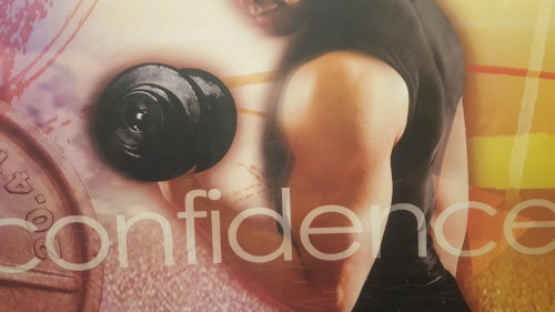
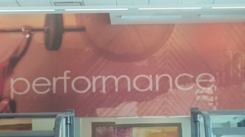
I regularly workout at LA Fitness, whose walls are covered in large images of fit folk working out, with a word associated with each image. Those words may be 'strength', 'fitness', or 'confidence'.  

The Problem

In the case of 'confidence', each letter has equal spacing the the left and right of it, except for the 'i' which is too close to the letter on its left, yet spaced appropriately on its right side.  For someone who likes balance, this uneven spacing is unsettling.

Notice how close the 'i' is to the 'f'

Notice how close the 'i' is to the 'f'

And don't get me started with 'performance'.

Note how the 'r' touches the 'f', and is so close to the 'm'

Note how the 'r' touches the 'f', and is so close to the 'm'


The Solution

Their graphic design person should pay attention to the detail of their work. Regarding the text used on visual displays, to make sure characters are purposefully designed with necessary kerning to achieve a pleasant visual result.  Space letters more evenly from letters bookending them. For goodness sake don't let them touch.

'Update Profile' Design Improvements for Wunderland

In my 2017 quest to find a UXD role at a company whose DNA includes user-focused products/services, I came across Wunderland staffing agency's website.  I attempt to register a profile by clicking that link in the left nav.

I was told to 'Enter Your Email'. I complied, opened a new browser to check my email (*dramatic sigh* at having to do all this WORK by leaving the site to click on this link), clicked on the link, was sent back to their site, to be told I already had a profile created in their system. Great.

PROBLEM #1
I then click the 'Update Profile' link and instead of recognizing me as having just requested the link, or recognizing that I just came to the site from the unique link they sent me, I'm forced to rinse and repeat this frustrating process.

SOLUTION #1
Create a way to recognize people visiting your site who've come back via unique link who then want to login to their profile, instead of making them start from the beginning of the convoluted login process.

Screen Shot 2017-01-05 at 8.18.46 PM.png

PROBLEM #2
Again I open a new browser, open the email, click on the link, and am taken back to the site.

SOLUTION #2
Be a normal website with a Username/Password login area to keep people on the site and decrease chances for abandonment and frustration (especially frustration).

Screen Shot 2017-01-05 at 8.19.00 PM.png


I know it's happened to you.  You've logged into the profile section of a website, made some changes, clicked the 'Submit button, then furiously look around for an acknowledgement that changes have been saved and you can close the browser for that site.

Wunderland staffing's profile section does a lovely job of showing me how to accomplish the #1 thing I came to their site to do - Find a Job.  Nice big, pleasing red, pill shaped button.  

PROBLEM #3
Upon submitting my profile changes, however, I missed the confirmation message, in small, undesigned font.

Live site as of 1/5/17

Live site as of 1/5/17

Suggested design enhancement

Suggested design enhancement

SOLUTION #3
While it does say 'Profile Updated' I completely missed that the first handful of times I looked at this page.  I propose calling out the message in a colored box, larger font, and instead of the standard, boring confirmation message font to use the Calluna Sans option for the headings, as it has more of a conversational, friendly tone to it.

Thanks for joining me on this recent stop on my 'Design for Good' tour. Please drop me a line if you have any thoughts to add, or a challenge you'd like to share.

My Contempt for iTunes

The Problem

In 2013 nearly 800 million people had iTunes accounts.  I have one, but I never use it, and wonder how many other people abandon the application after minimal usage due to frustration and confusion. 

When I first started using iTunes about a decade ago, I'd reliably visit itunes.com to try and launch the app.  Once on the site it wasn't clear how to do this task.  I'd spend time clicking around the site, almost always giving up and re-downloading the app so that I could find it, to open it.  

When I had the forethought to go into my Folder/Applications and open it there, it would constantly require a download of the latest version which was frustrating. As a light user downloading every time I used the app was creating friction against using it. And I just couldn't get my head around why accessing my music required searching through folders for the app and not an easily accessible dashboard/UI.  There was something important missing from how I experienced iTunes.

The Solutions

  1. Allow logging into an iTunes account from iTunes.com.  
  2. Automatically create a desktop shortcut so the app is easily visible and doesn't require navigating through folders or the conceptualization that this needs to happen.
  3. Create an automated email welcoming new users that explains how and where to access your account.
  4. Usability test the iTunes experience to validate its design. 

Admittedly, I've never been much into music.  But had my iTunes experience been better Apple would have made money off me, guaranteed.  I quit trying to access the app due to my contempt for it, which was heightened due to it being such a design-centered company and this clear disconnect between what I thought Apple stood for and my frustrating interactions with it.

Trapped in a Stairwell

The Problem

At General Assembly Chicago, if you try to exit the building by taking the stairs to the first floor, you will encounter the stairwell.  It is unmarked, and while there aren't many floors to choose from being a relatively short building, I still managed to exit on the wrong floor because I had to guess which one was street level, and I guessed wrong.  

The Solution

Remove human error.  There shouldn't be guessing when exiting a stairwell, and this is a problem with a simple, inexpensive solution.  Clearly mark each floor, at a minimum with floor numbers noting which is street level, and to delight with tenant names and suite numbers, in the stairwell itself.  This will allow people to confidently exit a floor without expending energy on making a decision. 

Textural Design for Glasses Cases

The Problem

I own two pair of Warby Parker glasses - one regular prescription and one prescription sunglasses.  I often carry both, in their cases, in whatever bag or purse I have with me.  There is no differentiation in cases between regular and sunglasses.  80% of the time the first case I grab isn't the pair of glasses I want as there's no way of knowing what you've got until you open the case and look inside.

The Solution

Because the problem involves a blind grab in a dark purse, my recommendation is to have textural differences between the two - one smooth case, possibly plastic, and one textured case.  This would allow both people looking at the cases and those going by touch alone to differentiate which type of spectacles are housed within, and make more accurate grabs when going for them.