THE CHALLENGE
A large % of online sales traffic comes from aggregators. We needed to increase the % of that traffic that reaches the quote offers page.
The aggregator experience

PO Focus:
Put all vehicles on one page and all people on one page to reduce # of pages.
My UX Focus:
Think bigger. More than reducing # of pages, there are two fundamental issues leading to high abandonment rates.
First big issue: The aggregator sets expectations that it’s one click to a quote. Allstate’s page loader content appears < 3 seconds on screen, is generic and has words but not time to read them. After spending time entering information for potentially multiple people and vehicles, you land on our quoting website and the header makes it sound like you’re starting from the beginning. Also, “what we already know”reads like only one person and no vehicles were transferred over.
Second big issue: After talking with our tech lead, I learned sometimes the aggregators don’t successfully pass over the vehicle information, so though you entered it there you have to now re-enter it here. Frustrating.
Competitive research
Liberty Mutual does a great job of welcoming you by name, telling you were you are (their site), and informing you that your data is transferring. Building trust and understanding of the experience.

Stakeholder Management
1) With business and UX focused on related but different ways to reduce abandonment, it took some repetition and selling to get their buy-in on the landing page being an easy yet important big win. AOS was in a ‘consolidate pages’ mindset as the solution to abandonment issues app-wide. My job was to find all possible issues and fight for the customer and what I believed to be in their best interest. Landing page content was the principle opportunity for improvement and was low effort/high impact. It wasn’t accurately setting expectations. While our writer finessed the wording, all changes were my recommendations.
Content changes:
When prospect’s name transfers, warmly welcome person in header
Instead of ‘let’s start with the basics’, say ‘let’s finish your quote’
State ‘we’ve collected the info you’ve already provided’ on this page to let them know they won’t have to re-enter it
Change ‘What we already know’ to ‘What we already know about the primary insured’
Re-arranging data points in landing page card to be easier to scan
2) Surfacing the issue to the POs of aggregators not always successfully passing vehicle data, they collaborated with internal teams to fix this issue with the VINs, increasing successful vehicle data transfers. Reducing the frequency of prospects thinking “Why do I have to enter this all in again?” and, hopefully, abandonment rates.

We also consolidated some pages, re-worked how vehicles and people are added, and where pre-fill data’s list of values are accessed. The biggest improvement, however, was accurately setting expectations on that first Allstate sales landing page.
Old flow
Aggregator site -> brief AOS loader -> AOS landing page -> 2 to 3 pages for each vehicle -> vehicle summary -> one page per person -> a separate ADPF values selection page for people -> people summary
New flow
Aggregator site -> AOS landing page -> 1 page for each vehicle -> vehicle summary -> one page per person -> people summary with ADPF values
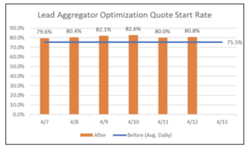
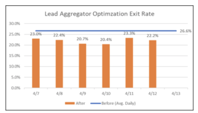
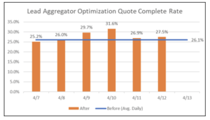
1-week Results
The online sales team tests its designs live by reviewing analytics. Our changes improved our metrics. (click to view carousel images)