
The challenge
APDA’s website has been added to in a Frankenstein-like way over the years. Platform limitations made it necessary to have multiple URLs/websites - the main site, Salsa Labs for donations, a site to share and read stories of people involved with PD, Donors Drive to create fundraising campaigns. In addition Bernard was used as their donor management platform. Visual designs that didn't match and user flows resulting in dead ends - these were some of their big issues.
Additionally, the main, footer, and right column page navigations were clunky and confusing to people.
Visitors to the site’s deep content are a result of coming from Google search. Currently people view 1.36 pages and time on site is 50 seconds.
We were awarded a contract to rebuild their site on WordPress, with accessibility and usability being top design concerns.
Their priorities were to make the following easy for users to their site:
Donations
Discoverability of services/events and chapters near them
Finding information on their annual Optimism Walk
Constraints
The client's website rebuild budget that, based on the scope of this project, didn't really provide for UXD
A 3 month timeline, short for this size project
Developers and a visual designer who are working on multiple projects concurrently
Client-chosen third party platform limitations
The Solution
I chose a quick-to-execute MVP plan that provided the best bang-for-the-buck, so to speak.
My Design Role and Tools
Working with our agency's Senior Visual Designer, Developers, and our SEO Manager, I contributed in the following ways:
Design Role
Listening Tour
Usability Testing (2 rounds)
Testing Moderator
Competitive Research
Wireframes
Information Architecture
Click Testing
Card Sort Test
Design Tools
Join.me
Balsamiq
Adobe XD
Optimal Workshop
Lookback.io
UserTesting.com
Listening Tour
This project began with 30-minute 1-on-1 calls with stakeholders to involve them in the process, hear their concerns and needs, and get their buy-in to the process. The following questions were asked:
What’s your role with APDA and how does it relate to the website?
What are your goals and objectives in your role? Top priorities? How do you measure success?
Who are APDA’s primary audiences online and what are their priorities and goals with your website?
Why do they use your website specifically?
What obstacles exist that might prevent people from using or choosing to use your site?
What questions do you have about your users that you don’t currently have answers to?
What are your goals for this site rebuild. If Chicago Style SEO is completely successful in this rebuild, what will that look like from your perspective?
Who are APDA’s online competitors, and how do you compare to them? What do you think you’re doing better than them? What are they doing better than you online?
Do you see any risks or red flags before we begin?
Additionally, I reviewed the notes their IT Audit company provided on the current technology situation on their website, and collected feedback from an important internal stakeholder group - their Local Chapter Executive Directors. This rebuild is both to improve the site experience for people with PD, their care providers and APDA donors, but also it’s for their chapter volunteers, who need the site’s backend to be simple to use while providing what they need to do their jobs.
Usability Testing - CUrrent Site
Determining Activities to Test

Working with our SEO team lead who consulted the data in Google Analytics and our visual designer, I came up with a list of activities for testing and sought input and approval from the client.
The client’s main website goals are to 1) support people affected by Parkinsons, providing information and resources to both patients and care providers 2) allow people to connect to a community in their area for information and support 3) accept donations so they can continue to do their work.
Moderated Usability Testing

Folder with Steve Krug's moderated usability testing script, tasks and scenarios, tasks and scenarios, System Usability Scale (SUS) ranking questions, and Amazon gift certificates
To test the current website, 6 moderated usability tests were performed on a group comprised of donors, people living with Parkinson’s and a care provider. One test was done remotely with five being in person. Of those five, one came to my office and four were done in the field where users would access the site. Some had experience with the site and some did not.
To set expectations and explain roles, I shared Steve Krug’s Instructions for Observers of Usability Tests with the client and my team.
When moderating sessions I follow Krug’s script to provide moderator consistency between sessions.
Qualitatively testing the site showed both us and the client its current failings. It validated what we already knew, supporting the decision to rebuild the site to allow for better management of information at the chapter-levels and for better integration of third party applications to result in a more seamless and uniform user experience. Testing also provided insights into how site visitors think when looking for particular resources. This guided creation of the proposed navigation structure.
The big issues were:
Confusion between Get Involved and Ways to Give in main nav
Donation pages utilize 3rd party software leaving people 'stranded' on an external site. Also, some resources or articles are links to external websites leaving people confused on how to get back to the APDA site.
Donation page designs don't feel good to use (ex asking for 'next of kin email address') and are missing opportunities via design tweaks to encourage bigger donation amounts
Use of the newsletter signup field as a search function based on placement on site
Below are screen grabs of the most important pages to redesign: home, informational, donate, & Optimism Walk.

Current website home page November 2016
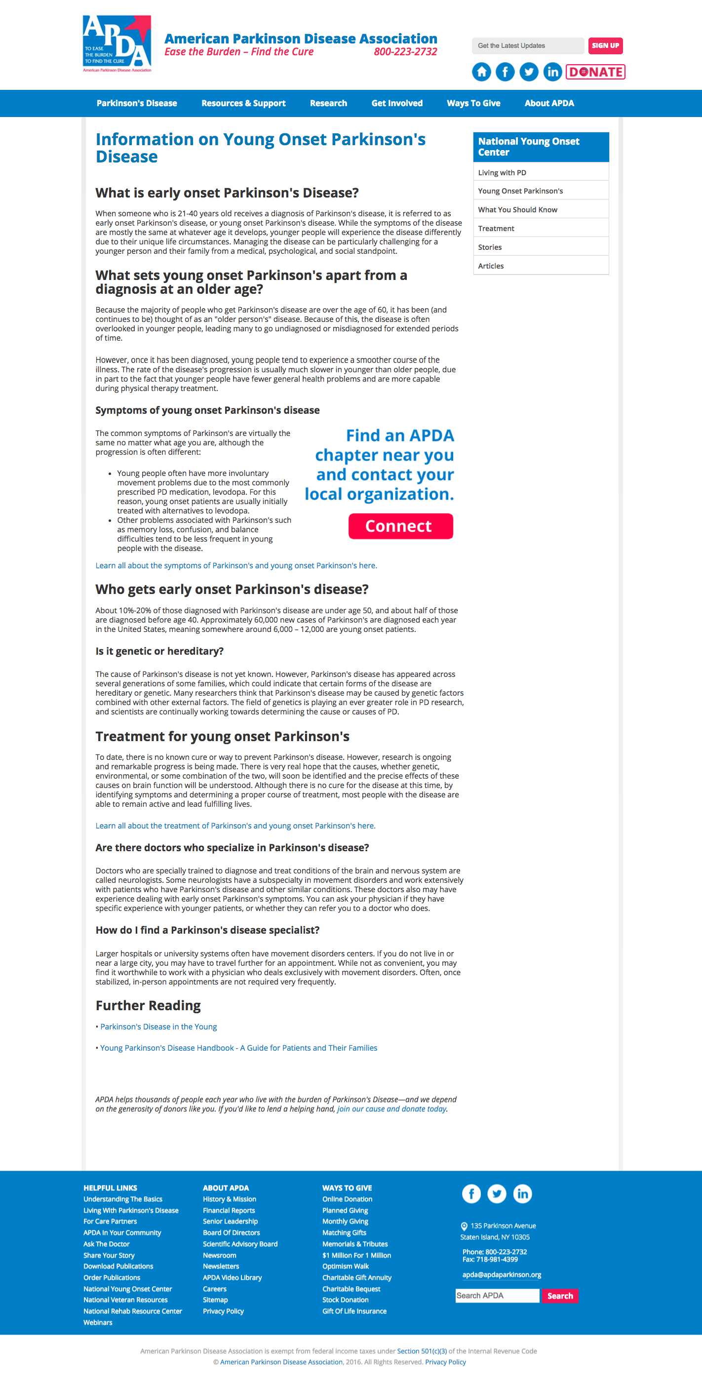
Young Onset page November 2016

Optimism Walks page November 2016

Make a Donation page November 2016
Competitive reSearch
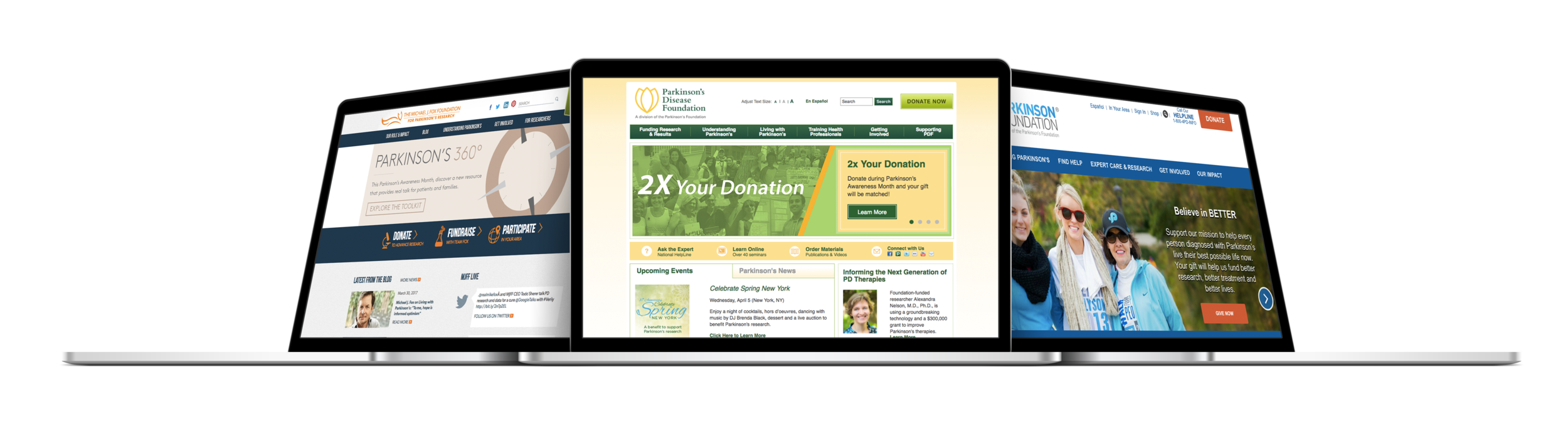
I researched not only other Parkinson's Disease organization sites, but also other heath care non-profits with large amounts of information and complicated IA structures, such as the American Diabetes Foundation and the National MS Society. Additionally, I looked at associations with chapter websites structured as subdomains (ex.domain.com/chaptername) to learn how they designed their navigation on both desktop and mobile.
I was looking to learn:
How they organized their information-dense sites
What their mobile experiences were like
How their chapter navs were different from their main navs (if applicable)
What accessibility designs they used
How they made donating money easy and obvious
Information Architecture
Card Sort Testing
Using Optimal Workshop, 18 participants were shown main navigation headings and had the option to create their own if they felt it necessary (a hybrid open/closed test). There were no big surprises, and based on this test we anticipate less confusion during our final round of usability testing when people are tasked with donating money and getting involved in an active way. This is based on our removing 'Ways to Give' from the main header and placing it as a subhead under 'Get Involved', while keeping an obvious 'Donate' CTA button in the heading.
Wireframes
My role was to provide quick layout inspirations to support our visual designer's hi fidelity wireframes which were presented to the client for approval. This being a large website IA was a challenge so I introduced a top header nav for the About, Events, Contact and Spanish links, while reducing links in the footer. With multiple PD groups people didn't understand it's USP (unique selling point) so I added the mission statement under the hero image and in the footer

Home page v1

Home page v2

Category main landing page

Optimism Walks landing page

Home page

Home page open state

Optimism Walk landing page

Main category landing page
Click TestIng
Click Test #1 - Optimism Walk
Information on APDA's biggest fundraisers, their annual Optimism Walks, is one of the most important items that needs to be easily located on the website. Using IntuitionIQ and Reddit I did a 1-click test to see if, looking at the proposed homepage header, people would be able to locate information on this event.
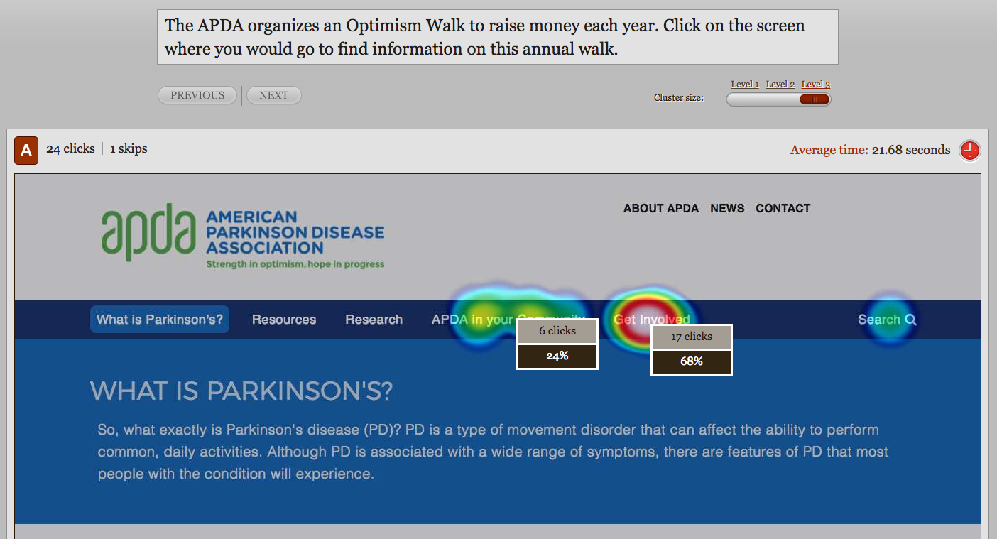
3/4 of people clicked where the Optimism Walk will be listed in the sub nav menu, 'Get Involved'. The remaining 1/4 clicked the other link where it would be found. "APDA In Your Community' will prompt people to enter a zip code to find local events or the chapter nearest them. While reinforcing that where we're placing this information fits the user mindsets of where it should live, we also know to recommend that the chapters, who control the content on their individual areas of the site, make the Optimism Walk easily discoverable (ex. homepage callout).
Click Test #2 - Chapter to Main Site Navigation

When on a local chapter section usability tests showed people didn't know how to navigate back to the national organization site because, per client preference, the logos on the local chapter sections had each chapter's name on them and when clicked directed people to the home page for the local chapter section.
We introduced both a house (home) icon and 'Back to National Site' text in the upper nav on mobile, and the house icon and 'National Headquarters' text in the upper nav on desktop, as our solutions which tested well.
Click Test #3 - Chapter Subdomain Navigation
Making it easier for people on the local chapter pages to find information on resources near them geographically, we introduced local chapter menus to the main navigation and as a left column navigation on large screens (below left), and as a separate hamburger menu on mobile (below right) that introduces a navigation tray just for the local events & programs, resources & support, etc. Will people be able to successfully navigate these local subdomains?

The majority of people clicked on areas that were considered successful for this task, so we feel confident that these design solutions will enable site usability.
Mobile was the most difficult to design for as, based on my competitive research, there wasn't an elegant solution because of IA challenges and limited screen real estate.

Usability Testing - Launch
Key learnings:
Problem: Local resources main landing page was confusing
Solution: Changed regional names of chapters to a listing of all state names
Problem: Navigation from chapter sections to the main site was difficult
Solution: added house icon, breadcrumbs, and 'National Site' text in header that linked back to main site home page
Problem: People didn't realize there are a main page with all printable/downloadable PDFs
Solution: We will sprinkle PDFs throughout the site as well on their relevant pages
Problem: Local chapter site navigation confusing. Once on chapter page people accidentally clicked main nav that sent you to main site's pages.
Solution: Introduction of chapter links under 'APDA in your Community' in the main nav when you're on a chapter section
Solution: Moved chapter nav as a visual element to the left column of the page
Problem: Post launch one of our devs decided to change the main navigation so you could either 1) hover over a main page title (ex. What is Parkinson's Disease), click it and be taken to that landing page, OR 2) click on a drop down arrow to view the associated mega menu.
Solution: Internally we felt this was a bad design so I did some quick video usability tests to be able to show the developer clips of how people are actually interacting with the site to persuade interaction design change. Incorporating a 0.5 second JavaScript delayed mega menu open when the main nav topics were hovered over (per a Nielsen Norman Group recommendation), we will reduce confusion and the number of clicks people have to make to find what they are looking for.
Example video clip of website navigation usability test (2 min length)
FINAL DESIGNS

New home page

Optimism Walk landing page

Young Onset landing page

Ways to donate $ landing page
Reflections
Looking back at this project there are some things I would have done differently based on what I know now, given a longer timeline and larger budget, and additional internal resources. You know, in a perfect world.
Information Related
Some of the recommended improvements that would support the goal of increasing donations include adding more emotional, engaging, storytelling copy on pages such as the Optimism Walks and DIY Fundraising pages. This, however, is at the client's discretion
I would have a clearer understanding of internal workload capacities and competing timelines for other client projects, and schedule weekly internal 30 minute meetings so each department is aware of what's currently being worked on and can ask any questions/get information they need from each other
Design Related
I would require more client participation in recruitment of usability test participants for those living with Parkinson's or their care givers
I would have tested chapter site designs prior to them being developed
I would have tested the site with users post launch, when the design kinks had been fixed vs. as-we-go during the soft launch period. Also, testing would continue and be iterative
I would have tested accordions or an up arrow on mobile to reduce the amount of page scrolling
I would have conducted usability tests with chapter leaders both on their chapter section experience and on their WordPress backend administration area experience
The SEO team will monitor Google Analytics data that will continue to shape recommendations to increase time on page, number of pages visited, and donations.