peckish
Native Android app to locate
food trucks, view menus,
and order food in-app
peckish
Native Android app to locate
food trucks, view menus,
and order food in-app
The Challenge
This was a portfolio project.
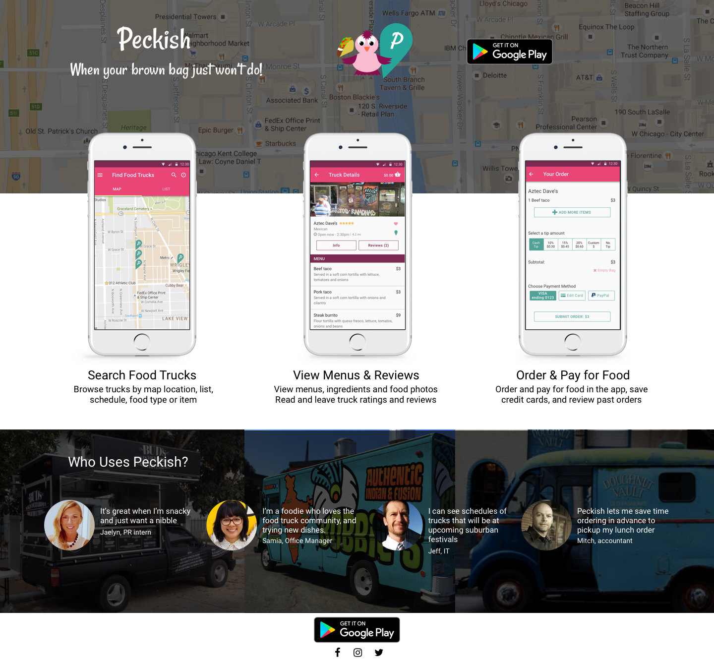
People like food trucks. They’re fun interruptors of regular meal patterns, exposing people to foods not often on their day-to-day plates.
But finding a truck involves a combination of inefficient solutions - following them on their individual Facebook and Twitter accounts for updates of where they’ll be, in some markets using a combination of existing, non-comprehensive apps that claim to be food truck finders but have only a couple trucks using the apps and even then with extremely limited functionality.
And finally, there’s the show up and see method of arriving at an event or walking outside your office building to see what you can find. Menu item discovery happens at the trucks themselves, and is followed by the wait in line to place and then wait for your order, often on a lunch hour with limited time.
The Solution

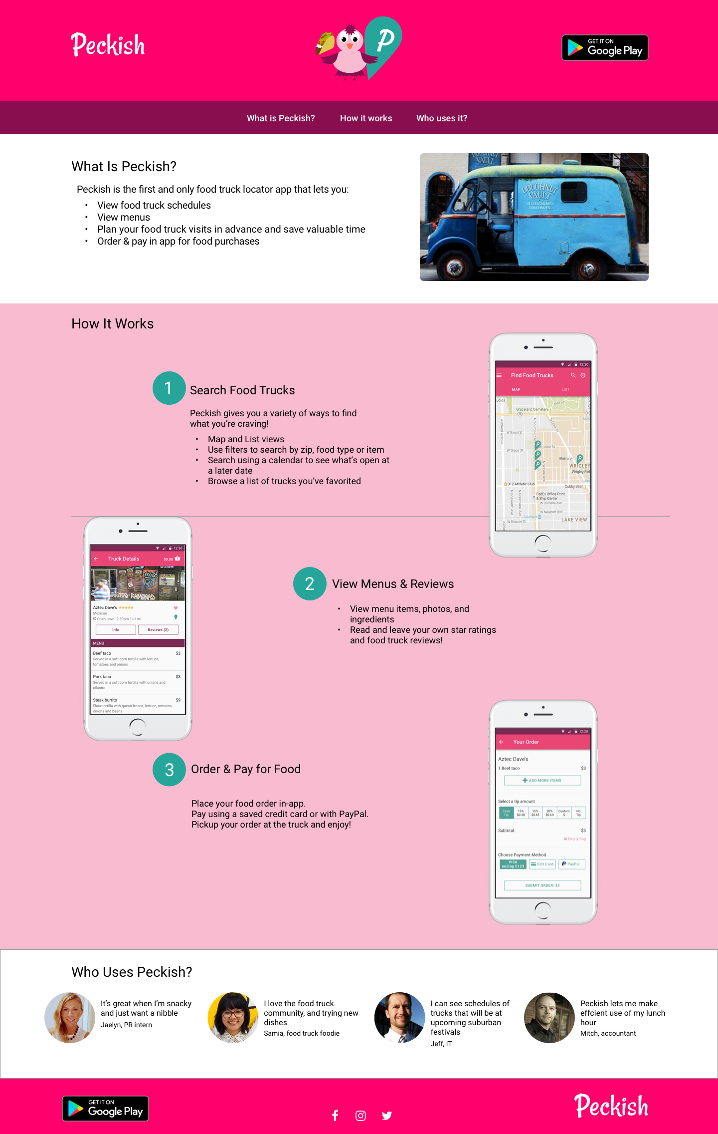
Peckish is a convenient, efficient food truck app that allows for geo-locating of trucks, viewing of truck information, ratings & reviews, menus, and in-app ordering & payment for at-truck order pickup. Your lunch hour just got tastier.
My Involvement
Design Tools
Pen & Paper
Illustrator
Sketch
Lookback.io
PopApp
InvisionApp
Google Forms
Photoshop
Usertesting.com
Peek.com
Draw.io
Balsamiq
Design Roles
Research
Identity
UI
Personas
Wireframes
Prototyping
Testing
UX Team of One
User Surveys
In addition to posting a food truck survey on my social media accounts, reddit.com/r/samplesize, and asking people I know to participate, I went to a popular lunchtime food truck destination in downtown Chicago to guerilla recruit participants. I received 35 completed surveys.
I wanted to learn:

How frequently people eat out
If they currently use a satisfactory food truck app
How far they’d travel for a food truck
How they would use a food truck app
Why they eat at trucks
Some Key Insights

Learnings included that most people aren’t currently using an app for food trucks, but if they were they’d want it to show menus, search by zip, and show photos of food items. Paying in advance for food through the app would reduce line wait times and is a familiar purchase behavior with respondents through sites like GrubHub and Seamless.
Personas

Based on survey responses, three user personas were created for this product:
The suburban festival-going food trucker
The downtown lunchtime office worker
The urban foodie
Competitive Analysis & SWOT
Companies researched: Seamless, Roaming Hunger & Food Trucks

Rationale:
Most people surveyed had experience ordering food online. Since no current food truck app offers this feature I closely studied the UI of Seamless (which is owned by GrubHub and shares many similarities) for its ability to view menus, leave ratings & reviews, store credit card details, & its checkout process. Because these two apps have large, mainstream adoption and are, at their cores, tech companies, I know I could learn a lot from their already-tested UIs and screen flows.
Roaming Hunger was the best food truck specific app I found. With it you can locate trucks around the world. It offered the most robust similar product for analysis.
Food Trucks is Canada-specific, and run by a media company, integrating food truck news, social sharing, and community content generation that warranted analysis.
User Stories & User FLows
The food truck user survey results and competitive analysis provided a solid understanding of how and why people would use this app. I made two spreadsheets for new and returning user stories, then prioritized them to determine what to include at launch. I used draw.io to create a flow diagram of how a new and returning user would interact with different screens in this app.

Identity Creation
Naming

To help name the app I brainstormed using a mind map. Food truck purchases bring to mind the words fun, spontaneous, casual and urban. I wanted a name with personality and attitude. Peckish is a common British term for ‘hungry’, as in ‘I am feeling a bit peckish’, which fits the food truck scene perfectly. You eat there when you want to casually pick something up, a sometimes spontaneous decision.
Logo

Using IntuitionHQ I conducted a preference test to help choose my final logo, which I created in Adobe Illustrator. Results were close and I learned people love food truck 1-click preference tests with an even 100 participants in 2 days. Ultimately the bird with taco and pin was chosen because in addition to getting the most voted, it also accurately portrayed this product’s main features (food items and geo-locating trucks)

Style Guide & UI

This app was designed following Google’s Material Design guidelines as much as possible, which guided font and colors decisions. Having nineteen main color options to choose from, the bright pink is fun while the pink and teal combo is reminiscent of candy (food). I purposefully wanted to be different from GrubHub/Seamless/Yelp which all primarily use red.
Product Design & User Testing - Lofi Wireframes
Product Design & User Testing - Lofi Wireframes
User Interface Design
User Interface Design
Usability Testing
General Findings
Getting my designs in people’s hands early proved beneficial, as they could tell me important visual design elements they wanted such as photos of food, Google Maps API integration, and the ability to enter your zip code to see pins on a map near you. Drawing from my past marketing experiences I realized including company logos was important for branding and truck photos were important to make order pickups easier.
A/B Test #1 - Truck details page
I tested in small batches, early and often, with this app. Before I had finished sketching all the screens, I ran an A/B test to determine how to design the truck details page. Option A shows a button on the truck details page to click to view a page showing a menu. Option B shows a details page with the Menu near the top and fully visible. Feedback favored B strongly, as users main goals with the app are to 1) find a truck 2) order food, and this design reduced a step in process.

Using PopApp I tested user flows with hand sketched wireframes to collect user input and learn expectations as pages were being created. This proved valuable, reducing potential wasted time in Sketch or Illustrator.
Rapid Prototyping of Test #1

“I want to get to the menu as quickly as possible if I’m using this app”
A/B Test #2 - Calendar Feature
Could users intuitively locate the calendar feature to view a list of trucks open on a later date? They answered quicker and were correct more often with the clock icon versus the three dots icon commonly found for secondary nav in Material Design.

I also ran two unmoderated tests on Peek.com with the core screens in mid-fidelity to solicit feedback early in this final phase. I learned that Google maps-like feature to get directions from your location to the truck would be useful, and that photos of food aid in decision making, especially if people are trying foods new to them (which is part of the food truck fun!)
Clickable Prototype
“Intuitive”
“Easy to use”
“Works like I think it should”
Reflections
- It was both freeing and restricting to use Google’s Material Design guidelines. I learned I can do good work within constraints, that design is much more than creating original visual elements, the valuable user benefits of working within a platform’s familiar UI patterns, and the power of recognition vs. recall.
- Creating this app that I myself would use, it would have been easy to get caught up in wanting to incorporate features I thought would add value or be cool, or interesting ones I saw competitors using. To avoid feature bloat, I began showing wireframes to people early on. This allowed me to hear people say what they needed to be able to use this product, and to focus my designs on those things.
- It is unclear whether the ‘Open Later’ calendar screen to choose a later date to view truck schedules sufficiently satisfied user expectations, and I would test more on that interaction. Having people go through those screens made sense to them, but my belief is they settled on how the design worked, by displaying a calendar date-picker only, and that it didn’t meet their expectations.
For FUrther COnsideration
In the Wild
Once launched, I would be curious to discover answers to the following things:
- Do people understand that they can only place an order for one food truck at a time, or do they try to order from multiple trucks in one session trying to pay one time?
- Do people need the address of the truck as a reminder after ordering and if so should it be on the order received screen and if so should it change to a permanent screen you need to manually navigate away from once you’re ready to dismiss it, or will the auto-notifications when the food is ready to be picked up (with address reminder), or the fact that they can go back to the maps page or the truck detail page for the address be enough?
- If this were a global app or, for that matter, outside of the midwest, the phrase ‘brown bag’ might need to change as it’s a local colloquialism.
- What would the adoption rate of food truck owners be and what would their MVP UI be for their backend experience?
- It would be interesting to see what other ways people would expect this app to work for them in real use scenarios.
Landing Page Options